
The latest colour palettes are intent on breaking free from traditional thinking and escaping the ordinary, but they have no fear of sober tones and neutrals, preferring instead to reinvent them.
The Pantone Color Institute’s 2018 colour forecast, published in its PANTONEVIEW Home + Interiors annual report, speaks volumes about the need for a new approach to the subject of colour, even within the four walls of our homes.
Delicate virtuoso performances and mix&match effects are no longer the sole preserve of top-end commercial and contract-furnished environments. Now, they’re charging into the residential world, and dusting down even the boldest tones, inspired – depending on style and atmosphere – by the 30 multi-coloured years spanning the 1960s, ’70s and ’80s.
Sticking to a strict diet of chromotherapy, the most observant design is gradually distancing itself from the idea of colour dominated by form, and eschewing its use as a mere dressing for surfaces and complements. Instead, it’s exploring the full potential of colour and deploying it as a defining ingredient capable of playing a leading role in the aesthetic output of a habitat.
An eclectic mix of vibrant colours, ready to quench modern consumers’ thirst for the new, and yield benefits for the environment and its inhabitants, has a warm welcome in store for design in general and interior decoration in particular next year.
The far-sighted trendsetters at Pantone had already started down this road when they chose “healing” Rose Quartz and Serenity as joint winners of colour of the year 2016, followed in 2017 by Greenery, a refreshing, revitalising tone denoting universal rebirth.
As we await the selection of next year’s title-winning colour, let’s take a stroll through the 8 most appealing and on-trend colour ranges of 2018.


Translated by Maryam Hosseini in Ceramic World Review Persian, no.31 , page 82/ March 2018
CLICK HERE
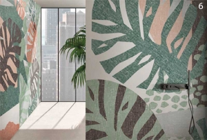
PALETTE #1: VERDURE
In the wake of the current “Urban Jungle”, design is still gripped by green.
Verdure ranges from foliage greens to berry-infused purples, in an effort to reconcile nature with structure by means of wallpapers, textiles, exotic patterns and, of course, plants.
1 – 41zero42
2 – Kartell by Laufen
3 – Coop. Ceramica Imola
4 – Pixers
5 – Mosaico+
6 – Glamora
PALETTE #2: PLAYFUL
Bold, eccentric and outstanding, this palette’s mission is to raise a smile, inject some fun and amaze the eye. It brings together those bright, vivid tones that reflect light-hearted joie de vivre: first and foremost, baby pink, yellow and lime, red and blue.
7 – Urban Front
8 – Farrow Ball
9 – Hartô
10 – Lago Design
PALETTE #3: DISCRETION
Discretion is a laconic reinterpretation of pastels for environments that fly the flag of romanticism, with a nod to vintage in their soft shades of lilac, turtle-dove
and aquamarine.
11 – Brick Wall
12 – Ceramica Rondine
13 – Ceramiche Piemme
14 – Lago Design
15 – Wallsauce
PALETTE #4: TECH-NIQUE
Indigo and pink, green and purple, even light blue and sand: a triumph of contrasts shapes this techno-inspired palette, which absorbs the highlights of “augmented” materials, ventures into the domain of optical illusion and explores the multifarious transparencies of glass and polycarbonate.
16 – Glas Italia by Patricia Urquiola
17 – Hartô
18 – Ceramica Sant’Agostino
19 – Farrow and Ball
PALETTE #5: FAR-FETCHED
The warmth of reds and yellows comes into contact with a touch of pink, light blue and beige in the enchanting Far-fetched palette. The result? A melting pot of ethnic influences and flavours that celebrates the joy of mixing by bringing together Ruby Wine, Iced Coffee, Cornsilk and Tourmaline in a single, coherent range.
20 – Wallsauce
21 – Ceramica Mutina
22 – Arthouse Palais
23 – Orla Kiely
24 – Ceramica Mutina
PALETTE #6: RESOURCEFUL
Complementary warm and cool tones come together in Resourceful: an imaginative universe that connects blues and oranges.
25 – Litokol SpazioContinuo
26 – Moooi
27 – Cerasarda
PALETTE #7: INTRICACY
The sumptuous Intricacy palette steals nuances from precious metals to create rich, full-bodied new neutrals, together with a splash of red.
28 – Gemanco Design
29 – Lago Design
30 – Emilceramica
31 – Ceramiche Ragno
PALETTE #8: INTENSITY
One name, one programme: the intensity of petroleum and sugar-paper are juxtaposed with burgundy and mustard to create modern-classic décors.
32 – Farrow Ball
33 – Cappellini
34 – Hartô


